

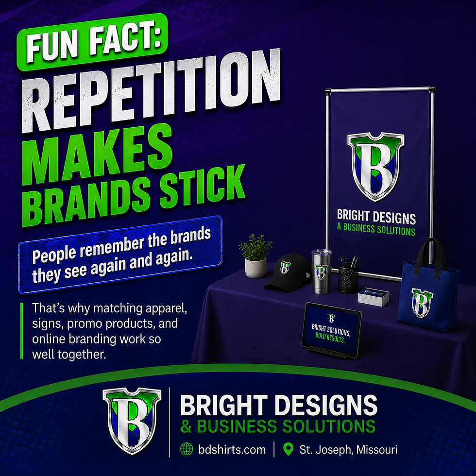
Fact: Repetition Makes Brands Stick
- Bright Designs

- Jul 3
- 1 min read
People remember what they see more than once.
That sounds simple, but it matters a lot for small businesses, teams, schools, events, and local organizations. One shirt can be easy to miss. One sign can be easy to walk past. But when the same name, colors, logo, and message show up in multiple places, the brand starts to feel familiar.
Same logo means faster recognition
A consistent logo helps people connect the dots. When they see it on a shirt, then a sign, then a table cover, then a cup or banner, they do not have to relearn who you are every time.
Same colors mean stronger recall
Colors are part of recognition. When your apparel, signage, and promotional items use the same color direction, people start to remember the look even before they read every word.
Same message means clearer identity
If your brand message changes every time someone sees you, it gets harder to remember. A clear message repeated in the right places makes the brand easier to understand.
Same look means more trust
Consistency can make a small business look more established. It shows planning, care, and professionalism. That does not mean every piece has to look identical. It means the pieces should feel like they came from the same brand.
Final thought
Repetition is not boring when it is done right. It is how people remember you. Bright Designs helps businesses, teams, events, and organizations build a consistent look across apparel, signs, banners, table covers, and promo products.
Comments