

Fun Fact: People Often Remember Colors Before Words
- Bright Designs

- Jul 7
- 1 min read
People often notice color before they read the words.
That is why color is such a powerful part of branding. A strong color direction can make a business easier to recognize, easier to remember, and easier to spot in a busy feed, event, storefront, or crowd.
Color creates recognition
Think about how quickly people recognize certain brands by color alone.
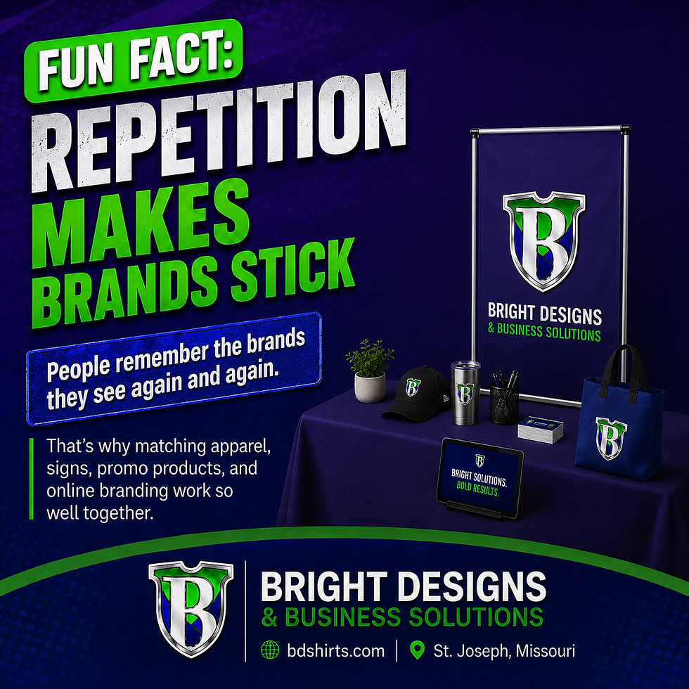
The same idea matters for small businesses. If your shirts, signs, website, social graphics, and printed materials use a consistent color direction, people start connecting that look to your business.
Color helps your brand feel familiar
Familiarity matters.
When people repeatedly see the same colors connected to the same business, the brand starts to feel more recognizable. That can make your business look more established and easier to remember.
Color still needs balance
Bright colors can grab attention, but too many colors can feel messy.
A strong brand usually has a main color direction, a few supporting colors, and enough contrast to keep everything readable.
Apparel and signs make colors visible
Brand colors do not only live on a logo.
They show up on shirts, hats, signs, banners, table covers, stickers, decals, business cards, social posts, and more. The more consistent those pieces feel, the stronger the brand recognition becomes.
Final thought
Words matter, but color often catches attention first.
When your color direction is clear and consistent, your brand becomes easier to recognize before someone even reads the full message.
Bright Designs & Business Solutions helps businesses build a stronger look across apparel, signs, print, graphics, and promotional products.



Comments