

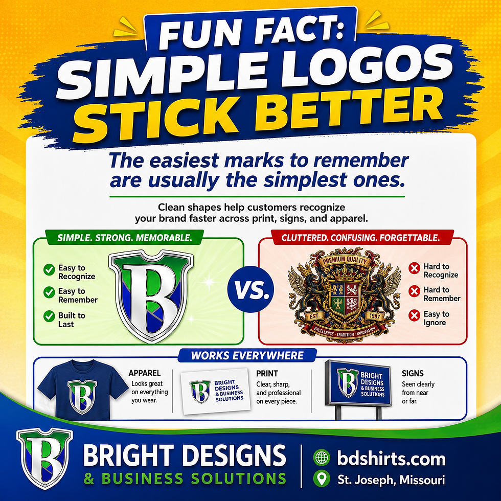
Fun Fact: Simple Logos Stick Better
- Bright Designs

- 5 days ago
- 1 min read
The easiest brands to remember are often built around simple, recognizable marks.
A logo does not have to be complicated to be strong. In fact, the simpler the shape, the easier it usually is for people to recognize it quickly.
Simple shapes are easier to remember
People often notice shapes and colors before they read every word.
That is why a clean logo can be so powerful. A simple mark can work on a shirt, hat, sign, business card, website, sticker, or social graphic without losing its impact.
Complicated logos can get lost
Detailed artwork can look impressive up close, but it may fall apart when it gets smaller.
Tiny text, thin lines, extra flourishes, and crowded elements can make a logo harder to read on hats, left-chest prints, decals, and small promo items.
Strong logos work everywhere
A good brand mark should still feel recognizable across:
- apparel
- signs
- social media
- promo products
- storefront graphics
That flexibility is what makes a logo easier to use over time.
Final thought
Simple does not mean boring. Simple means memorable, flexible, and easier to recognize.
Bright Designs & Business Solutions helps businesses create branding that works in the real world, not just on a screen.



Comments